
If there is one thing I am certain of from roughly four years of piecing together publications, it is that I learned more from actually doing it than from classroom theory.
Some of that is a matter of time. It is near impossible for a single class to fully cover everything one will encounter on the job. Part of it is repetition. Lessons can be told you in a classroom, but sometimes they don’t sink in until you are facing them for the tenth time in the same day.
One of the issues I ran into on a regular basis was the result of a hangover from the days of typewriters: double spacing between sentences. I, like many others, was taught to type this way.
In the age of typewriters, this made sense as typewriters were set up to monospace the letters. Basically, this means that whether it was relatively thin letter such as “i” or a wider letter such as “w” it would be given the same amount of space on the page. To help the eye distinguish when one sentence ended and the next began, two spaces were used to create a more distinct separation.
In the age of computers, most fonts automatically adjust the spacing between letters making the need for a more distinct separation between sentences disappear. Yet because people were taught to type with the double space without knowing the purpose, many have never stopped doing so.
When fitting text into a publication, this sometimes creates problems.
Example 1 shows a paragraph typed with the double space method. Example 2 shows a paragraph with just single spaces. For the most part, the difference between the two is negligible at this point.

However, when the same text is forced to touch both sides of a column (known as justification) we begin to witness a clear difference. Example 3 shows us the double spaced sentences, while Example 4 shows us the single spaced version. The portion highlighted is of particular concern with the extra large gap a direct result of having an extra space inserted between the sentences.

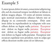
This issue may not seem to be that big of a deal, and in truth one will get a little of this regardless of how the text is formatted, but it increases the likelihood of the issue occurring which in turn leads us to situations such as Example 5 where we have multiple of these gaps lining up in what is known as a “river.” Such awkward spacing is unsightly and ultimately can become distracting for a reader even when they are not fully consciously aware of it. This in turn decreases the readability of the text which defeats the whole purpose of putting it up in the first place.
For more on the double spacing issue visit: http://www.fonts.com/content/learning/fyti/typographic-tips/double-spaces

Thanks for including visuals and a link to additional information!
Interesting, I never even noticed the double-space thing! I’ve been doing a lot of internet/computer writing (none of it of the paid variety, however), and I didn’t even consider this. I guess I’m too young to think much of the effects the typewriter would have on internet writing.
I can’t wait to read more on your blog.