Publication Layout

Tags

, , ,

One of the trickiest elements of publication design is determining where everything is going to go.

Determining Page Numbers

One of the first aspects to determine when laying out a publication is to know how many pages there will be, or the page count.

Determining the page count comes in part based on the ad-to-content ratio. Just because a publication has enough material to fill 32 pages in a particular issue does not mean they can actually financially justify it.

A second aspect to consider is how the publications are printed. Where I worked, we would have two pages printed side-by-side on a single large sheet of paper and then folded down the middle. Add in the two pages on the reverse side and you have a total of four pages on the single sheet of paper.

What this meant was we were always working in units of four. In other words, we could not just ad a single page to the publication. We added four at a time. Many times we found ourselves on that boundary of not quite having enough to go up a full four pages, but having way more material than we could comfortably fit into our current page count.

Organizational Structure

Another aspect was keeping similar content together. While we might like to believe the target audience would pick up our publication and read it all cover-to-cover each time, the truth is that is unlikely. If someone is interested in the sports news, they do not want to have to hunt through the whole publication just to find the sports articles which have been scattered throughout the whole issue.

This brings up another point: continuity. If the publication always has political news on page three, people will come to expect it there. Should the political news suddenly get moved to page thirteen, the political news junkie is going to turn to page three, not see it and get frustrated. If the publication is lucky, they will keep digging and find it. If the publication is not lucky, the political news junkie has already drop it, and picked up the competition’s publication.

If your publication is not easy for people to use, you have wasted your time creating it.

Putting it All Together

With the page count determined and a basic order formed, the publication can begin to be put together. The first step where I worked was usually dropping in the ads or at least reserving the space for them (we knew the sizes ahead of time). From there we could begin arrange the content, trying to get a good mix of text and photos while not having too many page jumps, and appropriately featuring the most important content.

Some material will always come in longer or shorter than anticipated and until the while piece is dropped in, material would be shifting around. It becomes sort of like a jigsaw puzzle, except the shape of the pieces keeps changing which leads to continuous headaches from beginning to end.

Yet when it is all done and you can see the final product, the headaches are worth it.

Space

Tags

, , , , ,

In an ideal world, when one was piecing together a publication, everything would just flow together perfectly with just enough material to fill the space. Not too much; not too little.

This being the real world, such optimal conditions rarely occur.

Too Little Space

Sometimes you will just have one or two lines too much of text and can make it fit by tweaking the tiny details like leading.

Often though, the extra material is far too much and you simply have to cut something. It could be an entire article, a photo, or segments from several articles, but decisions will need to be made. These decisions will be based on issues like relevancy and timeliness, size, and appearance (photo-less pages tend not to inspire much interest for readers).

You may have heard of the inverted pyramid often used in media as a form to write stories. Although some have questioned its usage, one advantage is that it can aid in the cutting process as the editor simply needs to jump to the end of the article where the details are less important to the story and start chopping. This allows an editor who may not know much about the story, or have much time to review it, to quickly edit it down.

Too Much Space

What tends to be a trickier issue is when you do not have enough material to fill a spot. Leaving an inch of space blank just because your article ended short of the allotted space looks bad and is an inefficient usage of space.

Often extra space means digging into the press releases that came in to find some small tidbit that fits both the space and the surrounding content. (Putting in an article about flowers on the sports page just is not going to fly.)

Another option is to have little filler “ads,” often for the publication itself, or a local charity or upcoming city event the public might be interested in. Where I worked, we always kept a few of these sorts of ads on hand to stick into the publication wherever they were needed.

Too Much and Too Little

A common problem is to simultaneously have both too much and too little space all at once. This usually results in headaches.

On a Senior Living page there might be way too much text, while on a Real Estate page there might not be enough. To maximize what you can get in, you may just have to break down and do a quick adjustment of where your content goes—which includes ensuring everything adjusts properly, still makes sense, and nothing important gets lost in the transition.

Dashes and Hyphens

Tags

, , , ,

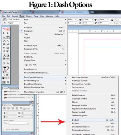
When using software such as Adobe InDesign, you may notice the option to include Em or En dashes (fig. 1).

Image

These dashes serve different purposes.

En Dash

Historically, the en dash was the width of a capital N (thus the name). The en dash is used when relating to periods of time. For example, the “2013–2014 school year,” and when connecting open compounds.

Em Dash

Historically, the em dash was the width of a capital M in the typeface and is about twice as wide as the en dash. As with the en dash, the name of the em dash comes from the letter it is connected to.

Most of the time someone uses a dash, they are using an em dash, or at least should be. It can potentially be used to add emphasis, indicate an interruption, or show a sudden change in thought.

Hyphen

Just as a point of clarification, a hyphen is a completely different symbol altogether.

Note the difference in the lengths between the three symbols:

  • 2013-2014 (hyphen)
  • 2013–2014 (en dash, the proper symbol to use in this example)
  • 2013—2014 (em dash)

For more on En and Em dashes and the usages visit:

http://www.quickanddirtytips.com/education/grammar/dashes-versus-colons

http://www.quickanddirtytips.com/education/grammar/em-dash-space

Lorem Ipsum

Tags

, , , ,

When developing a layout for a publication (or brochure, poster, website, etc.) designers often use what is referred to as “dummy text.” (Also called “placeholder” or “filler text.”) This is text with essentially no meaning.

There are a couple of reasons for using such text.

  1. The designer may not have the finalized text yet, but wants to figure out the layout
  2. When looking at a design, it is easier to focus on the design elements and ignore the words when the “words” have no real meaning

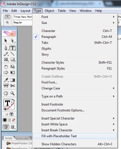
There are numerous ways to create this dummy text from simple hitting random letters, to using a text generator built into your design software as shown below in Adobe InDesign (called “placeholder text” in InDesign), to using a generator online.

PlaceholderText

Lorem Ipsum

Perhaps the most commonly known type of dummy text, and my personal favorite however is Lorem Ipsum.

Lorem Ipsum is Latin text which has been scrambled up into meaningless sentences. This combined with the reality that most of us today do not speak Latin helps keep the actual words form being much of a distraction when developing a design.

The big advantage to using Lorem Ipsum over randomized letters is that it is created from real words, which means it more naturally replicates the flow of words. When just randomly typing or using a text generator that is just throwing out randomized letters and spaces, the text will have too many long or too many short words in close combination which can display a distorted view of what the finalized piece will ultimately look like.

Finding Lorem Ipsum for Your Project

While there are multiple places online to find Lorem Ipsum text, I typically go to http://www.lipsum.com/ where I have never felt l had to worry about someone deliberately putting in silly or inappropriate words or phrases–an important thing to be sure of when showing a boss or client your base design.

Printing to the Edge

Tags

, , , , ,

Most printers cannot print to the edge of the paper. To pull the paper through the printer or printing press, space is needed for the gripper to grab hold of the edge of the paper and pull it through. If one attempted to put ink along this space it would merely smear all over the place in a cacophony of blurred color.

Instead what is done is that the publication is printed on paper larger than the final size and then trimmed down. This seems simple enough, but there is a catch, particularly on large-scale printing presses which involve a lot of moving parts: vibrations.

Vibrations

Vibrations are a problem that haunts the printing processes. If you have ever picked up a newspaper where the layers of color do not seem to quite line up, chances are good that it is because the equipment has had enough vibration as it has been run that the color separations are no longer lining up correctly. For big jobs, the press will periodically need to stop and make adjustments to counteract the vibrations.

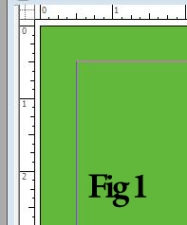
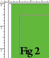
If one sets the color to be printed to the edge of the page (Fig. 1) and the page gets vibrated off to the side, then one could easily end up with a narrow gap of white space down the edge (Fig 2).

Image Image

Trimming

The other side of printing to the edge is the trimming process. As the publication is being printed on larger paper, it must be trimmed down to the proper size. Again, this seems simple enough, but remember that the vibrations in the printing press have thrown things off a little so that each page is not necessarily centered in the exact same place as the other pages.

One could conceivably sit there and trim down each page individually going off the edge that has been printed on that particular page. This is not so bad when you have a half-dozen pages to trim. Yet it becomes a mite impractical when one is talking about trimming a few hundred or thousand sheets. If you base you cut off the top sheet of paper, it may or may not correspond with the sheets in the stack below.

Bleed

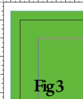
The response to these printing issues involves what is called bleed. Bleed refers to carrying your background beyond the intended edge of the paper. Where I worked, we usually did this about a quarter inch (fig 3).

Image Image

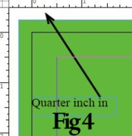
On the opposite side, we would make sure nothing vitally important (say the actual text, photos, etc.) was within a quarter inch of the intended edge of the paper (fig 4).

Together, this gave us some wiggle room so that if the vibrations threw things off, or the trimming was not lined up quite right it would be less likely to be noticeable. Setting this up however meant that one had to be aware of this process from the beginning of the design so as not to push anything important too near the edge.

Italics and Obliques

Tags

, , , , ,

Today we are going to tackle another terminology issue: Italic vs. Oblique.

Italic

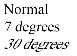
Italic text is text which has been deliberately designed on an angle. As such, the italic text can appear quite different from the “normal” text with which it is grouped.

Oblique

Oblique text is which has taken the “normal” text and merely tilted it.

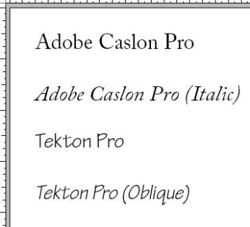
We can see the difference in with Adobe Caslon Pro vs Tekton Pro.

Image

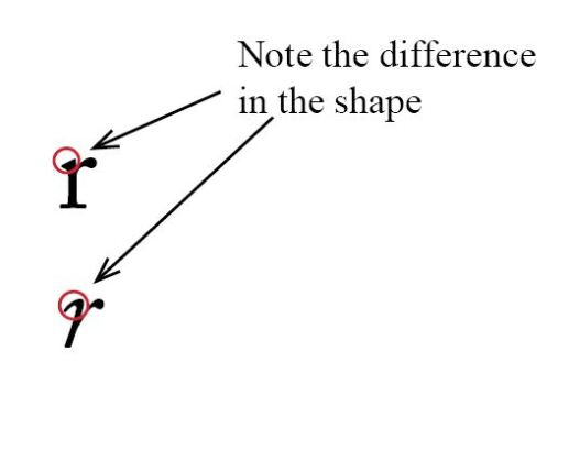
Notice how the letters in Adobe Calson Pro are formed completely differently. The “r” is an easy one to spot the difference.

Image

With Tekton Pro, it is simple a tilt of the normal letters rather than a complete redesign.

When using software such as Adobe InDesign, it is even possible to create your own oblique version of a typeface merely by selecting the regular type and manually skewing it.

Image

Advertising Placement

Tags

, ,

If one is creating a publication with the intent of making a profit, chances are pretty good that the publication is going to have advertising. This is a good thing. While subscriptions can bring in some money, they often do little more than cover the production or mailing costs. Yet having ads in one’s publication brings its own challenges.

Conflict of Interest with the Publication

Right off the bat, the advertisers and the publication have a conflict of interest. See while the publication wants and needs ads, they also need readership. The advertiser however is primarily just interested in how many people see their particular ad.

Imagine if the front page of the local paper was just one big ad. No publication name; no real content; just an ad. From the advertiser’s viewpoint it is well on the way to being a successful ad. (The public has seen it after all.) Yet chances are, very few people are picking up the paper to see what is on page two.

Conflict of Interest with Each Other

Another issue is avoiding placing competing ads too close together, and showing “favoritism” to one particular company by giving them better placement. For example, if Tarzan’s Tires and Tires by Jane both are running ads, they probably will not be thrilled to find they were placed on the same page. This is of particular issue if one of them is offering a much better deal than the other.

Similarly, if Tires by Jane has an ad placed near a feature story while Tarzan’s Tires gets pushed onto an all ad page, chances are good that you’ll be hearing about it.

Taste

Sometimes placing ads comes down to matters of taste too. Have a cooking page? Chances are your septic system ad should go somewhere else.

Limited Resource: Space

Finally there is the issue of limited space. If your publication is designed to have a single ad on the front page, once that ad is sold, no one else can have an ad there. While potential advertisers tend to understand the concept of “first come, first serve” they may not be quite as happy to find out that you have signed a contract with an advertiser to run the front page ad for a year—thereby completely eliminating the possibility that they can advertiser there.

On one hand, you have just received a guaranteed ad for a year. On the other hand, you may have just made three or four potential advertisers angry and less inclined to advertise at all. Was it worth it?

In addition, if your publication ends up with too many ads (in comparison to the actual content), it will again begin to lose readership. Sometimes one has to gently find ways to encourage a late ad to run in the next publication instead,

While ads can be vital to a publication’s survival, they can also come with all sort of complications and much of the production time and effort can be spent on issues surrounding them.

Designing on a Grid

Tags

While there is more than one system of designing a publication’s layout, the ones I worked for were primarily based off of a (relatively simple) grid. The idea is to provide a simple way to put everything in proper (consistent) place without having to reinvent the wheel each time you go to create a new issue.

It is pretty common to save space around the edge of each page where nothing that needs to be printed will be placed. There are multiple reasons for doing this, primarily to do with the printing process. While there are ways to work around it, generally speaking printing presses need room to actually grip the paper to pull it through, and some “wiggle room” in case the paper is not quite lined up correctly.

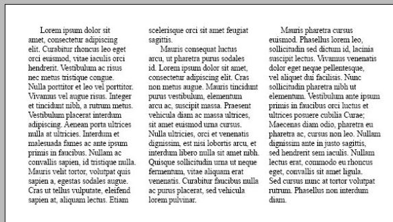
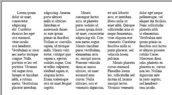
Within the remaining space, one would need to decide how many columns to have. This would partially be determined by factors such as the typeface we were using and the size of the type as you don’t want to have lines of text that are incredible short, but also want to have a fairly flexible layout.

I’ll show you what I mean.

Image

Image

Our lines of text in the top image (3 columns) are a bit short, but functional. The lines in the bottom image (5 columns) are so squished that reading is going to become difficult. If the text itself was smaller, one could conceivably look at smaller column widths, but in this case it would create problems.

Next, things like pagination, a masthead, headlines, advertising and photos need to be considered. Chances are the publication is going to place the masthead and page numbers in the same place every time so those can have a reserved space.

Typically one would have rows breaking up the page vertically as well. While these might be ignored at times, they give a framework on which to build. For the publications I worked for, these row sizes corresponded to advertising sizes. That way when we sold an ad that was 1 column wide and 2 rows high, we knew exactly how much space to save for it before it even came in. The more complex your page became, the more important these rows became.

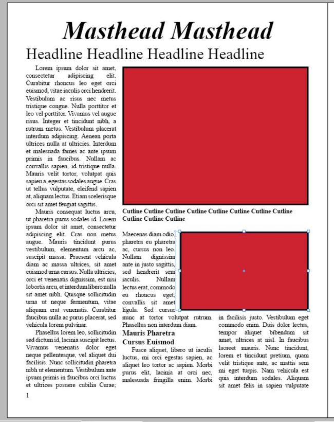
Let me show you a few more quick things:Image

Although the row breaks is not incredible clear here, you can see based on how the text at the top lines up with the top “image” (red square in our sample) that would be the edge of one of the rows. Another can be seen at the edge of the second column of text and the second image.

The second (lower) “image” “breaks the grid.” Sometimes this can work nicely, but here it creates some awkward spacing within the second column. If it fit directly within a column width, it would avoid this issue.

Further down we see a subhead that creates two issues of its own. The first is the awkward “trapped white space” to the right. The second is that the change in type size throws the rest of the column off so that that the text no longer lines up evenly with the text on either side (seen most clearly at the bottom).

Careful planning of the grid can help with both of these issues, but a degree of it is always going to threaten to appear and may at times require creative problem solving.

For a more detailed examination of grids, visit http://www.thinkingwithtype.com/contents/grid/

Designing with Type

Tags

,

An Abundance of Typefaces

One of the hallmarks of amateurism in publication design is an overabundance of typefaces. As if thinking that just placing a nifty typeface on the page will somehow improve the overall design, would-be designers splatter the page with typeface after typeface expecting somehow their unique combination of Helvetica, Times New Roman, Impact, Bickham Script Pro, Arial, Calibri, Arno Pro, and Comic Sans to wow the world.

It won’t.

Not only are the typefaces likely to clash, and when similar but not quite the same appear to be failed attempts to match a previously used typeface, but will likely leave the intended audience confused as recognizable patterns within the design will have been difficult to establish.

For the publications I worked with, we normally stuck to two primary typefaces: a serif and a sans-serif that complemented each other while being clearly distinguished. One would be used for the primary text while the other would be used for text which needed to stand apart a little such as a cutline.

Bolds, Italics, and Underlines

In an effort to draw attention to their product, would-be designers often make everything bold, italic, underlined, and bigger, bigger, bigger. Unfortunately, rather than drawing the audience in with eye-catching wonder, this merely makes everything on the page appear exactly the same—as if nothing was done to highlight the page except adding annoying, unnecessary visual detail. While such elements have their value, they should be used with purpose.

Consistency

The typefaces within a publication should be used consistently. If headlines appear in Times New Roman bold throughout the first page of the publication, they should still be appearing that way on page twenty-four. This makes it easier for your audience to learn the patterns of the publication and find what they want. If they are made to work to find what they want, they will move on.

Challenges to Great Design

Sometimes it just is not possible to have amazing design in a publication. This is not to say it is poorly designed, or that one should not strive to design it well, but at times issues get in the way.

Time

One of these issues is time. Publications tend to be on deadlines. Sometimes the deadlines are purely of the publication’s own making, but often the deadlines are influenced by outside concerns such as advertisers who need their ads to be out on the street by a particular date, or a printing press whose schedule leaves them a narrow window to print that particular project.

When coming up against such a deadline, one has to make choices. Do I have time to tweak this page to look as good as it can, or do I need to move on? Do I correct the spacing on this article or do I tweak the photo so it prints correctly?

Budget

Another issue is the budget. Can you buy graphical elements, or are you going to be forced to either build them yourself (often with limited time to do so) or do without entirely. Can you afford to spend a few additional hours making the final adjustments, or have you run out of the budgeted amount you can pay someone to do the layout?

Ads

Advertisements, while usually necessary to keep the publication profitable, create their own design issues. Depending on the circumstances, the publication may have limited control over what the ends themselves look like. If the advertiser is happy with the ad, but it isn’t quite the right size (a problem I found to be pretty common), or it has colors which clash, you can find yourself in a bind.

Further, the sales associates may only have been able to sell a particular ad by promising specific placement—like on the front page. As more ads are promised particular placements, your flexibility rapidly declines, and often you will find the promised ad placements are in key locations where you would ideally want articles and photos.

Masthead

Speaking of limited flexibility, the location of your masthead rarely changes. It is the publication’s personal advertisement, and needs to be located so that the potential audience can see it sticking up in a magazine rack or newspaper stand. Usually this means putting it right up at the top of the page big enough for a passerby to read it without even really trying. Which means that article you really want to feature is already overshadowed by at least one element on the page.

When faced with such challenges, one simply has to work around them as best as possible, knowing it might not end up ideal, but that getting the product out in solid, although not prefect, form on time and budget, is better than perfect design a week late and way over budget.